Monday, October 27, 2025
- 1 The design is a symbol of consideration. The children's colors and the spirit of harmony will color the future of Hokuryu Town.
- 2 Design is "problem solving" and "compassion"
- 3 The story of how Hokuryu Town's "Sunflower" logo was born
- 4 The new logo incorporates "individuality" and "connection"
- 5 The "colors" of Hokuryu Town chosen by children
- 6 Gathering the "feelings" of the entire town to create a logo for the future
- 7 Youtube Video
- 8 More Photos
- 9 Related Articles
The design is a symbol of consideration. The children's colors and the spirit of harmony will color the future of Hokuryu Town.
On Thursday, October 23rd, classrooms at Shinryu Elementary School and Hokuryu Junior High School in Hokuryu Town connected online with professional designers in Tokyo. This was part of a town-wide project to create a new logo and catchphrase for Hokuryu Town, "What will bloom next?"
This special class was designed to expose the children who will be responsible for the future of Hokuryu to the joy of design and give them an opportunity to think about the future of their town as something that concerns them personally. At Shinryu Elementary School, fourth, fifth, and sixth graders gathered in the library, while at Hokuryu Junior High School, first, second, and third graders gathered in a classroom for a joint class.
In both cases, the classroom is displayed on a large monitor.

Giving shape to the town's appeal: Katsuyoshi Takahashi, Director of Policy Planning
At the beginning of the class, Katsuyoshi Takahashi, general policy officer at Hokuryu Town Hall, who planned the class, spoke to the children:
"The purpose of creating this logo is for everyone to take another look at the charms of Hokuryu Town and give form to the town's aspirations. Hokuryu Town has abundant nature, warm-hearted people, and the ability to continue to take on challenges. This logo and catchphrase embodies our past progress, the challenges we face in the future, and our desire to connect people."
The motif of the new logo is "sunflower petals." They represent the "individuality" and "connections" of each and every person in Hokuryu Town. When these petals come together, they will help the future of the great town of Hokuryu bloom. This warm image was shared.
All the students used notepads connected to Shinryu Elementary School's Wi-Fi to share their design information. I was amazed at how they seemed to use them so naturally.
Design is "problem solving" and "compassion"
The lecturers for this event will be people from SoldOut Inc. (Bunkyo-ku, Tokyo), the company that also created the logo and website for the Sunflower Festival.
The event was moderated by Yamagami Naoto, and art director Ozawa Naho began with a lecture delving into the essence of "What is design?"
SoldOut supports the growth of small and medium-sized enterprises and venture companies across Japan, including regional areas, through digital marketing, software development, media production, etc.
A world surrounded by familiar designs: Naho Ozawa
What do you think of when you hear the word "design"?
Ozawa explains how our lives are surrounded by design, such as our favorite manga, the snacks we often eat, and the games we play. Design can be divided into different types, such as fashion design, spatial design, product design, and visual design (graphic design).
Among these, he explains that the role of "visual design," which deals with posters, logos, packaging, etc., is to "communicate instantly through the sight (visual sense)."
The "bad design" hidden in elevator buttons
At this point, Ozawa posed a question: "A typical elevator button."
"What's not good about this?"
The students who were nominated gave one accurate answer after another, such as, "The kanji characters for 'open' and 'closed' look blurry to people with poor eyesight, so they can't tell which is which," "They're almost the same shape," and "It would be easier to understand if they were made into arrows (instead of kanji)."
Ozawa nodded deeply and explained that this was exactly the problem with the design. "In an elevator, you have to press the button instantly, but the kanji characters look similar and are hard to understand. And some people can't even read kanji."
Design work that gives shape to "compassion"
"The work of design begins with identifying a problem.
Designers try to solve the problem of "Kanji characters being hard to understand." They think, "What if we expressed it using the orientation of a triangle?", "Would it be easier to understand if we added hiragana?", "If there are a lot of elderly people, let's make the letters bigger.", "If there are a lot of foreigners in the area, let's add English.", "If there are a lot of people in a hurry, let's change the color to make it easier to distinguish."
Furthermore, we sometimes use illustrations and simple symbols to communicate with people who don't speak the same language. This allows the meaning to be conveyed intuitively and in a more enjoyable way. We try to imagine things that can be conveyed more quickly and by anyone.
"What shape, what letters, what colors should I use to communicate what I want to say directly to the people I want to communicate with? That's what a graphic designer's job is to think about," explains Ozawa.
This is exactly the act of putting "compassion" into practice by empathizing with the other person, putting yourself in their shoes, and deeply imagining their situation.
The story of how Hokuryu Town's "Sunflower" logo was born
Ozawa also explained the background behind the creation of the current Sunflower Festival logo.
Exploring the unique characteristics of Hokuryu Town
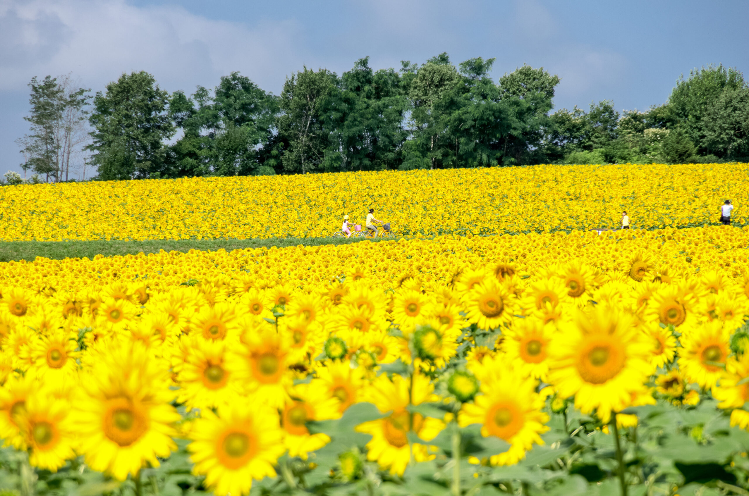
When creating a logo, the designer begins by getting to know the place well. They build an image by listening to various stories from the people in the town, such as "2 million sunflowers," "yellow is the town's color," and "it's a place that makes you feel energized just by visiting."
At first, we came up with an idea that combined the scenery of a sunflower field, the cuteness of sunflowers, and the energy of the sun. However, we were left with the question, "Wouldn't this be a logo that could be used for other sunflower fields as well?"
A design that incorporates a passion for soil cultivation
So we went further to explore the unique features of Hokuryu Town. We learned that "the sunflower fields themselves are hills" and "soil preparation is of the utmost importance to ensure that the sunflowers continue to bloom every year."
By extracting these elements that are unique to Hokuryu Town, the logo was created to incorporate not just the shape of a flower, but the silhouette of the hills of Sunflower Village, the setting sun there, and a passion for soil cultivation.
"As a designer, I am very happy that this mark has been created, that the people of Hokuryu have accepted it, and that they use it with care," said Ozawa with a smile.
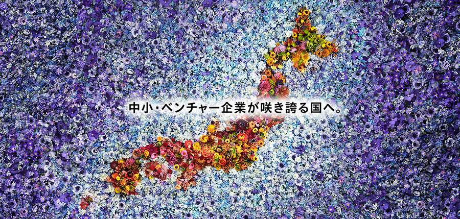
The new logo incorporates "individuality" and "connection"
"Now we need a new mark that will represent not just the Sunflower Festival, but the entire town.
This is the new logo design that became the subject of this workshop. While inheriting the spirit of the Sunflower Festival logo, the motif of the sunflower petals is deliberately expressed as squares of different shapes and sizes, and the whole represents the 12 months of the year in Hokuryu Town. "The image is of the petals circling around, continuing forever," says Ozawa.
This represents the richness of each townsperson's "individuality," and how these overlap and connect to form a single "harmony."
"What should I make bloom next?"
This catchphrase contains a question for the future: not only should we preserve tradition, but we should also work together to cherish and nurture the new challenges that will arise in the future."
The "colors" of Hokuryu Town chosen by children
For this workshop, the children were given the homework of painting the logo with a color that represents each month in Hokuryu Town.
"Even though it's December, I find it interesting to see that each person has a different color," said host Naoto Yamagami.
Children compare their work with their friends sitting next to them and discuss why they chose the colors they did.
The 12 Months of the Year: Katsuya Aonuma
From here, Aonuma Katsuya took over to communicate with the students. "This workshop with the students today is an important process that will be of great help to them in creating logos in the future," Aonuma said.
Then, several students explained the reasons for the colors they chose.
Although it is both August and many students associate the yellow of sunflowers with the hot season, some students choose "red" and others choose the "blue" of the sky.
When a student announced that September and October would be "gray," Aonuma asked why. "Adults tend to imagine a rigid color scheme, but you all have a lot of different ideas, and it's really interesting to hear," he said, impressed by the students' ideas.
Light blue represents ice, beige represents earth
- One student who chose light blue as the color for June said, "I chose light blue because the snow melts and the sky turns blue."
"It's the rainy season, when hydrangeas start to bloom, so I chose the color of hydrangeas," said the student who chose purple for June.
- The student who chose yellow-green for October said, "I chose yellow-green because October is the month when rice plants take on the color."
- The student who chose light blue for December said, "When it starts to snow, sometimes it freezes over. I chose light blue to represent that ice."
- The student who chose beige for March gave a unique presentation, saying, "I thought that when the snow starts to melt, soil and other things will come out."
The transparency of the ice in Hokuryu Town's harsh winter. The warmth of the soil that appears as the snow melts.
On the other hand, one student said, "In October, grass and other plants start to wither and turn brown, so I chose brown."
These are high-resolution "colors" that can only be chosen by those who live in Hokuryu and experience the town firsthand. The children's pure sensibilities vividly captured the scenery of their hometown.
Gathering the "feelings" of the entire town to create a logo for the future
We will create a new logo color together with you: Naoto Yamagami
Yamagami Naoto concluded by saying, "Finally, we will combine the colors of you, everyone associated with Hokuryu Town, and your fathers, mothers, grandparents, and others to create the new logo color. We plan to announce it around December, so please look forward to it."
Thank you to the children: Katsuyoshi Takahashi, Director General for Policy
Policy Director General Takahashi also expressed his gratitude to the children.
"It was really interesting to see how each person's thoughts were packed into the colors. I think it made me realize how deep design is and how fascinating it is to give shape to your own thoughts.
This project is not just about drawing pictures, but about everyone discovering the charms of Hokuryu Town and shaping that charm into a future. Like the petals of a sunflower, each individual's individuality and thoughts will come together to make the big flower that is Hokuryu Town bloom. I believe that your work will be a step towards that.
I hope that today's experience will inspire you to try expressing your everyday feelings and thoughts in words or design. The town is currently creating opportunities for you to experience and take on new challenges.
"I would be happy if this experience gives you even a little bit of strength to be proud of your town. Thank you very much to everyone today," said Director General for Policy Studies Takahashi in a message of gratitude.
The individuality and consideration of each individual. The diverse colors collected from the children will combine with the many feelings gathered from the entire town, and eventually blossom into a unique logo of the "spirit of harmony" that symbolizes the future of Hokuryu Town.
The thoughts of each and every townsperson come together, uniting their hearts to depict a spirit of harmony and compassion, and the one and only blooming sunflower logo of Hokuryu Town is filled with boundless love, gratitude, and prayers...
Youtube Video
More Photos
Related Articles
We will bring you the "now" of this vibrant and shining town with a population of 2,100 and an aging population rate of 40%. The town of Hokuryu, where families are as bright and harmonious as sunflowers...

Hokuryu-cho is a happy town full of smiles and energy, where people "share the joy of...